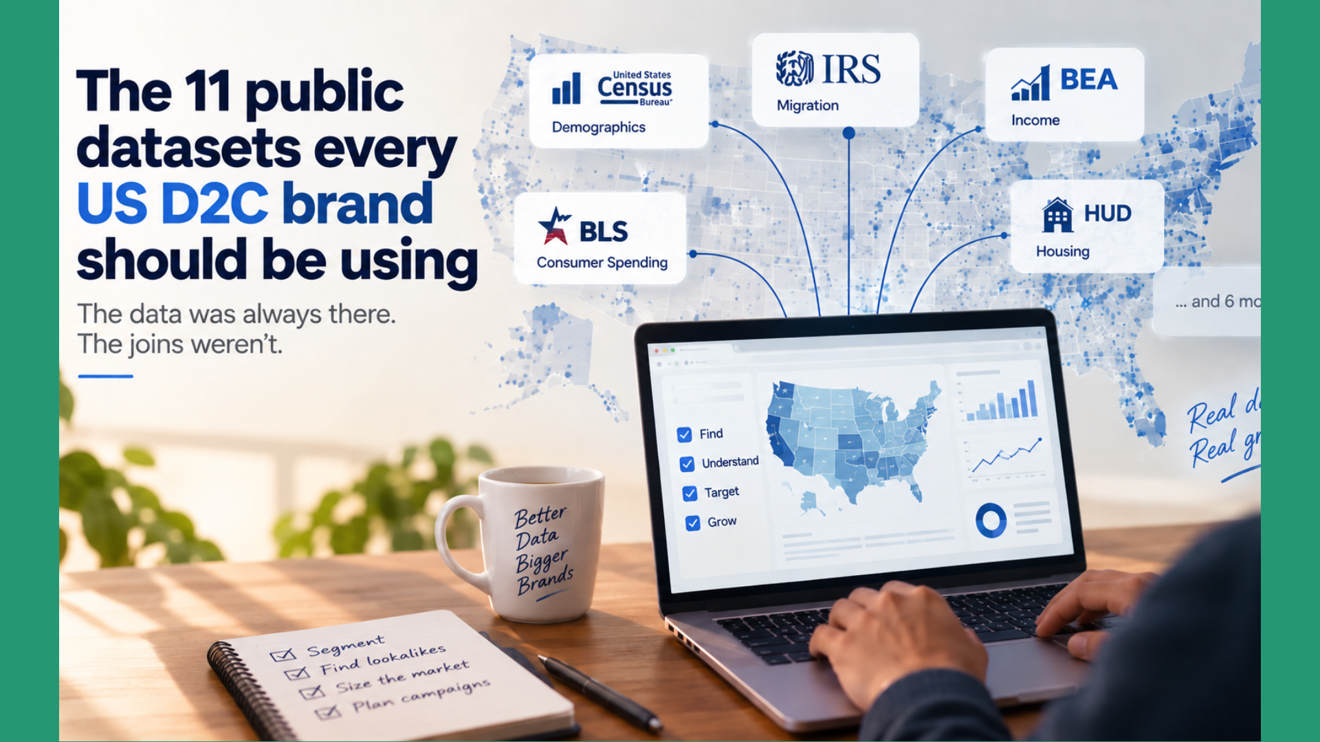
The data was always there. The joins weren’t.
D2C founders pay $499 a month for audience insights, a few hundred more for a Meta ad partner claiming proprietary demographic data, and another chunk for lookalike models built on data anyone can pull for free.
The federal government publishes better data than most of what these tools resell. Household income at every ZIP in America. Category-level spending by income bracket. Where affluent households are relocating. Where broadband can actually support your video checkout. What Americans have stopped doing with their time.
None of it is hidden. All of it is free. Most of it has been publicly available for over a decade.
The reason it’s underused isn’t discovery — it’s that the data lives in eleven different portals under eleven different geographic units (ZCTA, tract, county, CBSA, HS-6, HS-10), and joining them requires knowing which is which.
Here are the eleven public datasets every US D2C brand should be using, grouped by what they unlock, with a specific growth play for each.
Who your customers actually are
1. American Community Survey 5-Year Estimates (US Census Bureau)
What’s inside. The deepest publicly available demographic dataset in the US. The 5-year estimates cover all 33,000+ ZIP Code Tabulation Areas (ZCTAs) with median household income, age distribution, household size, education, race and ethnicity, housing tenure, commute patterns, and languages spoken at home.
How D2C brands use it for growth. Take your top 20% of customers by AOV from Shopify. Compute the median income, age skew, and household size of the ZIPs they live in. Now rank all 33,000 US ZCTAs by similarity to that signature. Your top 100 lookalike ZIPs are the ones to hit first with paid, direct mail, or influencer seeding — with no black-box “audience” telling you what’s in the segment.
Access. data.census.gov or the Census API (free, key optional). Also downloadable as flat CSVs by table.
Caveat. 5-year rolling means lag. The 2024 release covers 2019–2023. Fine for stable demographics; wrong tool for post-COVID migration or gentrification tracking.
2. IRS SOI County-to-County Migration Data
What’s inside. The IRS Statistics of Income division publishes annual county-to-county inflow and outflow tables based on tax-return address changes. It counts households that moved, people that moved, and the adjusted gross income that moved with them.
How D2C brands use it for growth. This is the underused one. Most founders think of migration as customer count. The interesting variable is AGI — the money that moved. If Austin lost $2B in AGI to Boise between 2022 and 2023, Boise was a market you should have been in eighteen months ago. Overlay AGI inflow with your current sales density and you’ll surface affluent-flight destinations still too new to be saturated by anyone else.
Access. irs.gov/statistics/soi-tax-stats-migration-data. Free Excel and CSV downloads, released annually.
Caveat. Only captures filers who moved and re-filed in the new location. Misses non-filers. Data lags roughly 18 months.
3. BEA Personal Income by County (Bureau of Economic Analysis)
What’s inside. Total and per-capita personal income by county, broken by source — wage earnings, dividends and interest, transfer receipts (Social Security, Medicare, unemployment).
How D2C brands use it for growth. Wage income and investment income buy different things. A county heavy on investment income (retirees in Palm Beach County) is a completely different beauty and wellness market than a county heavy on wages (working households in Kent County, MI) — even at the same total income. And the transfer-receipts ratio is a fast proxy for demographic age skew when ACS lags. If your product skews to a specific life stage, this is the fastest way to score every county in America.
Access. bea.gov → Regional Data. Flat downloads and API. Free.
Caveat. County-level, not ZIP. Pair with the HUD crosswalk (#8) to go finer.
What they can actually afford and spend
4. Consumer Expenditure Survey (BLS)
What’s inside. The Bureau of Labor Statistics tracks what US households actually spend across ~200 categories, cut by income quintile, age of reference person, and region (Northeast, Midwest, South, West).
How D2C brands use it for growth. Real TAM sizing. If you sell premium haircare, look up spending on “personal care products and services” for the top income quintile in urban Northeast households. That figure is your realistic wallet-share ceiling per household — multiply by ACS household counts and you have a TAM built on what people actually spend, not what your pitch deck rounds up to. Most founders skip this step and either wildly overshoot or radically undershoot their revenue targets.
Access. bls.gov/cex. Flat tables, API, and pre-built cross-tabs. Free.
Caveat. Regional, not ZIP-level. Use it for sizing and pricing, not targeting.
5. FRED — Federal Reserve Economic Data
What’s inside. The St. Louis Fed maintains ~800,000 economic time series. The ones D2C brands should track: credit card delinquency rates (national and by metro), consumer sentiment, personal saving rate, retail e-commerce sales.
How D2C brands use it for growth. Early warning system for discretionary softening. When credit card 90-day delinquencies rise in a metro, discretionary spend on beauty, apparel, and non-essential home categories softens two to three quarters later. Pull paid spend back in that metro before your ROAS collapses, not after. This is the answer to “why is our LTV degrading?” three quarters before your finance team notices.
Access. fred.stlouisfed.org. Web, API, and Excel add-in. Free.
Caveat. Regional coverage varies by indicator. Some series are national-only.
What’s already selling there
6. Census County Business Patterns (CBP)
What’s inside. Annual data on US business establishments by 6-digit NAICS code and geography, down to ZIP level. Includes establishment counts, employment, and payroll.
How D2C brands use it for growth. Retail saturation check. If you sell direct but want retail partnerships or physical presence, count “45611 — Cosmetics, Beauty Supplies, and Perfume Stores” establishments per capita in each metro. Metros with the right demographic signature (from ACS) but low store density are white space. The same logic works for spa services, specialty food, and dozens of other D2C-adjacent NAICS codes.
Access. census.gov/programs-surveys/cbp. Flat downloads and API. Free.
Caveat. Two-year lag. Some records suppressed for confidentiality in small ZIPs.
7. USA Trade Online (Census Bureau)
What’s inside. Detailed monthly US import and export data by 10-digit HS commodity code, country, and customs district.
How D2C brands use it for growth. Two plays. If you source raw materials or finished goods internationally, track your HS code’s import volume and unit values — you’ll spot pricing shifts before they hit your COGS. If you compete with import brands, watch which categories are getting flooded and from where; a 40% year-over-year jump in Turkish personal-care imports means your unit economics are about to get pressured in the mid-tier.
Access. usatrade.census.gov. Registration required, but free.
Caveat. HS codes take a session to learn. Product-level detail is at HS-10; industry-level at HS-6. Start at HS-6 and drill down.
Reach and infrastructure
8. HUD USPS ZIP Code Crosswalk Files
What’s inside. HUD publishes a quarterly-updated crosswalk between USPS ZIP codes and Census geographies (tracts, counties, CBSAs, congressional districts), with allocation ratios for ZIPs that cross tract boundaries.
How D2C brands use it for growth. This is the Rosetta Stone. Your Shopify orders arrive with USPS ZIPs. Census demographics live at tracts and ZCTAs — which are not the same thing as USPS ZIPs. Without this crosswalk you’re either doing bad joins (and drawing wrong conclusions) or paying a third-party vendor to do the joins for you. Neither is necessary.
Access. huduser.gov/portal/datasets/usps_crosswalk.html. Quarterly CSV downloads.
Caveat. ZIP ≠ ZCTA. USPS ZIPs are delivery routes; ZCTAs are Census-defined polygons. Know which one you’re joining to before you run the query.
9. FCC Broadband Deployment Data (Broadband Data Collection)
What’s inside. The FCC’s map of fixed and mobile broadband availability, refreshed twice a year, aggregated from address-level provider filings. Includes number of providers, max advertised speeds, and technology type (fiber, cable, DSL, fixed wireless).
How D2C brands use it for growth. Two situations. If you’re expanding into rural and semi-rural markets, e-commerce conversion correlates hard with broadband speed — you cannot A/B test your way out of a market where 40% of households are on DSL. If you’re a video-heavy brand (product demos, live shopping, PDP video), broadband coverage in your target ZIPs directly shapes creative strategy and load times.
Access. broadbandmap.fcc.gov. Interactive map plus bulk downloads.
Caveat. Historically self-reported by ISPs and known to overstate coverage. The post-2022 Broadband Data Collection methodology is better but still imperfect.
Cultural and behavioral signals
10. CDC PLACES
What’s inside. The CDC publishes model-based estimates of health behaviors and outcomes at census tract and ZCTA level. Prevalence of physical activity, obesity, smoking, sleep under 7 hours, chronic disease indicators, and mental health metrics.
How D2C brands use it for growth. Direct fit for wellness, nutraceutical, fitness, and athletic apparel brands. Cross high physical activity + high median income (from ACS) and you have your ideal athleisure ZCTAs. Cross high sleep deprivation + high income and you have your melatonin, CBD, or premium mattress ZCTAs. This skips the “target fitness enthusiasts” ad-platform vagueness and gives you specific ZCTAs to hit.
Access. cdc.gov/places. Web tool, flat CSV downloads, and API.
Caveat. Small-area estimates, model-based rather than directly measured. Directionally right; not precise at the individual-ZCTA level.
11. American Time Use Survey (BLS)
What’s inside. An annual survey of how Americans actually spend their day, in minutes across ~400 activities, cut by age, sex, income, region, and presence of children.
How D2C brands use it for growth. This one is for product development, not targeting. When ATUS shows meal-prep time among under-35s has dropped 22% over a decade, that’s the origin story of every meal-kit and ready-to-eat brand. When it shows caregiving time compressed for higher-income households, that’s the wedge for premium childcare-adjacent products. Read ATUS regularly and you’ll see the next category before the next founder does.
Access. bls.gov/tus. Flat data files and pre-built tables. Free.
Caveat. National, not local. Use it upstream for product and category decisions, not for geographic targeting.
The point isn’t the datasets. It’s the joins.
Every one of these has been publicly available for years. Most have been free since before the current wave of D2C brands existed. None of them are hidden.
But no single one of them answers a business question on its own.
- ACS tells you who lives in a ZIP. IRS SOI tells you where they’re moving. Combine them and you get pre-saturation expansion targets.
- CEX tells you what a household spends on your category. ACS tells you how many such households exist in each metro. Combine them and you get a TAM you can actually defend to a board.
- CDC PLACES tells you where health-conscious households cluster. ACS confirms which of those clusters can afford your price point. Combine them and you get a launch map.
- HUD’s crosswalk makes all of the above possible against your own Shopify data.
The reason D2C brands still pay third-party audience tools isn’t that those tools have better data. It’s that they’ve done the joins.
That last part — the joins — is what we built Visual Verb for. But even without us, this list is enough to start.