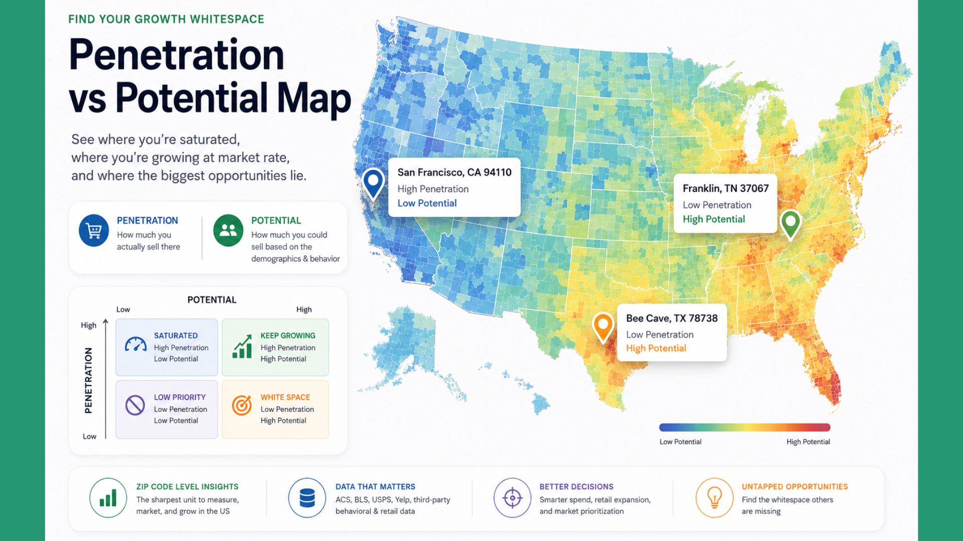
A penetration-vs-potential map is a geographic view of a business that plots two numbers side by side for each geographic area, such as a ZIP code, DMA, county, or postal region.
Penetration – how much you actually sell there – and
Potential – how much you could sell there based on the demographics and behavior of that geography.
The gap between the two helps you understand :
- Where you’re saturated,
- Where you’re growing at market rate, and
- Where you have untapped whitespace.
For US D2C brands, ZIP code is the sharpest unit to measure these variables.
A few of the reasons are that ZIPs align with USPS delivery, US Census (ACS) demographics, and Meta/Google ad geo-targeting – the same geography is in your orders, your customer profile, and your paid media.
The two numbers, defined
Penetration is nothing but your share of a geography. The cleanest form is:
Penetration (ZIP) = Your customers in ZIP ÷ Addressable Total households (or people) in ZIP
Sometimes it is also expressed as revenue per household, orders per capita, or customers per thousand adults in the relevant age band.
Here we need to focus on the ratio rather than the number. You want a number that’s comparable across ZIPs of very different sizes.
Potential is the addressable opportunity in a geography, qualified by who actually buys your category.
For a $60 skincare brand, potential is not “population” —> it’s “women 25–54, household income $75k+, in a ZIP where Sephora foot traffic is above the state median.”
Potential is built by:
- Taking public data :
- US Census ACS for income, age, education, household composition;
- BLS for local employment;
- Yelp Fusion for local retail/foot traffic;
- USPS for delivery counts.
- Filtering it to the demographic and behavioral signals that match your existing customer base.
- Rolling it up to the ZIP level as a score, index, or dollar figure.
The map is the two numbers rendered as a choropleth, dot map, or a paired bivariate map (penetration on one axis, potential on the other). The specific rendering matters less than the fact that both numbers exist for every geography, on the same map, at the same time.
What problem does this solve?
Most US D2C brands spend on ads by looking at Meta or Google’s data – past performance data. It helps you understand only where your sales/traffic came from, not where you should be focusing.
Past performance data doesn’t tell you whether the geographies you’re spending on have the most opportunity left, or whether the geographies you’re ignoring have the most upside.
Our approach fixes the following three specific problems :
1. Overspending on saturated ZIPs: Coastal metros – NYC, LA, SF, Boston, Miami – show up as top revenue geographies in almost every D2C dashboard. They also have the most competition, the highest CAC, and the least remaining penetration ceiling. A penetration-vs-potential map lets you see which of your “top” ZIPs are actually close to their ceiling and no longer deserve incremental spend.
2. Missing the white-space DMAs: Cities like Nashville, Columbus, Raleigh-Durham, Salt Lake City, Kansas City, and Indianapolis routinely show high potential scores for premium D2C categories and very low penetration – because they aren’t in the default ad geographies most operators picked when they set up their first campaign. The map surfaces them.
3. Retail expansion decisions: For brands considering wholesale into Ulta, Target, or Whole Foods, the map answers “which regions already have enough brand affinity to sell through?” and “which store trade areas are still underpenetrated online?” It becomes the input for a store-list negotiation.
The map doesn’t tell you what to do. It tells you where the question is – which is more than most D2C brands have today.
What the map helps: Examples from three US D2C cases
Example 1: Skincare, $60 AOV, 18 months old. Shopify shows top revenue ZIPs in Manhattan, West LA, and Miami Beach. The penetration-vs-potential map, built with ACS income + age filters and Sephora footprint from a third-party source, shows those three ZIPs are already at 4–6× the national average penetration and near their demographic ceiling. Meanwhile, Franklin, TN (37067) and Bee Cave, TX (78738) show potential scores in the top 5% nationally with penetration barely above 0.2×. The recommendation: cap spend in Manhattan, run a geo-lift test in Franklin and Bee Cave.
Example 2: DTC pet food, natural/premium. Penetration is highest in California and the Northeast. Potential – built with ACS household composition (households with a dog), income, and Chewy’s known distribution as a proxy for premium pet spend – points to a very different geography: exurbs of Atlanta, Charlotte, Nashville, and Dallas-Fort Worth. The brand launches a regional Meta campaign geo-targeted to 40 specific ZIP codes and gets 2.3× the ROAS of its national baseline in the first 60 days.
Example 3: Home goods / small kitchen appliances. The map reveals that the brand’s “national” performance is entirely a story about eight DMAs. Ninety-two percent of ZIPs are effectively untouched. The strategic answer isn’t “spend more on ads” – it’s “we don’t have national distribution yet; we have eight-city distribution.”
Common confusion: What is not a Penetration vs Potential map
“Isn’t this just a heat map?” No. A heat map shows one number – usually revenue or order count – colored by geography. It answers “where are my sales?” A penetration-vs-potential map holds two numbers per geography and answers “where is the gap?” A heat map by itself will always tell you to spend more in New York.
“Isn’t potential just population?” No. If you use raw population, every large metro will dominate the map and you’ll get the same answer you already had. Potential has to be qualified – filtered by the demographics and behaviors that actually predict category purchase. A ZIP with 40,000 households of the wrong profile has less potential than a ZIP with 8,000 households of the right one.
“Isn’t this the same as TAM/SAM/SOM?” TAM/SAM/SOM are aggregate national numbers used for pitch decks and board conversations. A penetration-vs-potential map is the same idea rendered geographically — TAM broken down to the ZIP level, with your current penetration overlaid. They answer different questions: TAM tells the market’s total size; the map tells you where inside that market to act next.
“Isn’t this just market share?” Market share is a ratio at the brand or category level. Penetration is one input to market share, measured spatially. A penetration-vs-potential map can be the source data behind a market share calculation, but it’s more granular and more actionable — market share tells you you have 3.2% of the US skincare market; the map tells you which forty ZIPs are pulling that number and which four hundred are missing from it.
“Doesn’t Google Analytics show this?” GA shows sessions and conversions by geography. It doesn’t hold a potential number for each geography, so it can only ever answer half the question. You have to bring the potential side yourself — from ACS, BLS, Yelp Fusion, or a vendor that has already assembled these into a scored file.
“Isn’t ZIP too granular — shouldn’t we look at states or cities?” Both are worse units for D2C than ZIP. States hide most of the signal: California contains both Beverly Hills and Fresno; New York contains both Tribeca and Buffalo — the variance within a state is far larger than the variance between states.
Cities have the same problem one level down (Chicago is Lincoln Park and Englewood; Houston is River Oaks and Sunnyside), plus two structural issues of their own. First, “city” is administratively fuzzy: most of a brand’s “Atlanta” customers actually live in Alpharetta, Sandy Springs, or Marietta – none of which are Atlanta proper – while Jacksonville and Oklahoma City look artificially huge because they annexed aggressively.
Second, Meta and Google don’t target by city name; they target by ZIP, radius, or DMA – so a city-level insight can’t be operationalized in the campaign that follows. ZIP (or ZCTA) is the smallest unit where public demographic data is still reliable and the unit your ad platform actually speaks – that’s why it’s the working unit.
FAQ
What is a penetration-vs-potential map? A penetration-vs-potential map is a geographic view that plots your actual sales (penetration) against the addressable opportunity (potential) for every ZIP code, DMA, or postal region, side by side, so you can see where you’re saturated versus where you have whitespace.
How do you calculate market penetration by ZIP code? Take your customers or orders in a ZIP, divide by the addressable household or population count for that ZIP (from US Census ACS), and normalize either as a rate (customers per 1,000 households) or as an index against the national average (1.0 = at market rate, 2.0 = double, 0.5 = half). Cohort by customer age (last 12 months only) so growth ZIPs don’t get penalized by legacy customers.
What data do you need to build a penetration map for a US D2C brand? You need three things:
(1) your own order data with a valid billing or shipping ZIP,
(2) US Census ACS 5-year data for demographics at the ZCTA level (free, public), and
(3) at least one behavioral signal that qualifies your category – third-party source for foot traffic, Yelp Fusion for local retail density, or a vendor panel for category spend. Currently, we have enabled only 1 & 2 in our platform.
What’s the difference between a heat map and a penetration-vs-potential map? A heat map shows one number, usually revenue or orders, colored by geography – it answers “where are my sales?” A penetration-vs-potential map shows two numbers per geography (actual and potential) and answers “where is the gap between what I’m capturing and what’s there to capture?” The second question is the one that changes decisions.
How often should you refresh a penetration-vs-potential map? Refresh penetration monthly – orders come in continuously. Refresh potential annually, or when a major public dataset updates (ACS releases in December). The map itself should be regenerated at least monthly or fortnightly so there is focus on the numbers.
Which ZIP codes should a D2C brand target first? Rank ZIPs by potential score, filter to ZIPs where current penetration is below 0.5× the national average, and take the top 40–60. Those are your highest-opportunity, lowest-friction targets. Run a geo-lift test on 15–20 of them before scaling spend across the full list.
Summary
A penetration-vs-potential map is the geographic version of a portfolio view — what you already own alongside what’s still on the table, in one frame. Built at the ZIP level with public data and refreshed monthly, it becomes the input to next month’s ad plan rather than a slide in next quarter’s board deck.